

role
ux/ui designer
skills
data analysis | persona/stakeholder analysis | wireframing | prototyping
tools
illustrator | sketch | aftereffects | invision
Find our process book here!
Large environmental displays engage members of the community and must be highly readable and easily understood. These displays must organize the data into valuable meaning . Skillfully using typography, composition, and color are crucial in creating an effective design that meets the needs of stakeholders and users.
The goal is to create a clear, efficient, and interactive data-driven environmental display to be placed in a public transportation location, Atlantis Hub. The display should take into account the needs of the users, while also allowing stakeholders to promote the PTF pass, which gives users the ability to take planes, trains, and ferries at a reduced cost.
In the end, we took a shopper’s approach to “sell” the San Juan Islands, and the PTF, to the users through a vibrant, engaging, and intuitive data dashboard.
Final Design — The Shopper’s Approach
View a Demo of our Final Design!


We engage the user with stunning, vibrant visual designs. Our new visual identity identifies with the identity of San Juan - expressing beauty and excitement. The vibrant visual language harmonizes with the Islands and becomes part of the positive experience of traveling.
We bring the user’s attention to just 2-3 locations to simplify the decision. To lessen the stress of Atlantis Hub travelers, our design allows a limited number of locations on the screen at a time. This way, users are able to connect the data from one screen to another smoothly.
Design follows the decision making process of the user in a simple left-to-right flow. Our screen follows a simple two-part structure, with the strongest border between the two parts indicated by a change in background color. These two parts serve as guides for decisions to be made.
We highlight the PTF Pass all over the screen. The importance of the PTF penetrates both sides of the display, without being overbearing. Our use of color puts focus on trips possible using the PTF pass, giving them slightly more hierarchy than the rest.
— Additional Tablet Control


Our additional control takes form of a tablet in front of the display that creates a personalized experience that deepens the value and understanding of the PTF pass for each location. The small control extends the user journey from the large display. It is designed to visually connect to the large display. Therefore, it is to be placed at a distance in which the large screen is properly visible, and at a height where a user would be comfortable standing and using.
The main screen is the overview of the San Juan Island destinations reachable by Atlantis Hub. A tap on Orcas Island takes the user to this page, where attractions and PTF opportunities are displayed. This closeup is aimed to personalize the user experience by giving more details about selected destinations.

The benefits of our control are not limited to the single user on the small screen.
A tap on each destination expresses interest, and is translated into a firework shooting from the island on the big screen. People who are looking at the larger screen might curious and want to interact with the small screen. The casual shopper can also understand which destinations are more popular, influencing the choices for their own trip.
The interaction is fun, and it also collects data for Atlantis Hub, helping them decide on which routes to focus on in future endeavors.
Our final design takes into consideration the needs of all types of users, as well as Elizabeth, the stakeholder. It is a chance to rebrand Atlantis Hub as a more intimate and delightful experience, harmonizing with the identity of the San Juan Islands. Through a vibrant, clear, and engaging display, we have “sold” the San Juan Island to users. Even more, we have encouraged them to travel with the PTF pass for added perks and bonuses.
Process — Understanding the Data


After being given a spreadsheet of data, we began by dissecting its elements into tables and charts. Before even thinking about potential designs, we wanted to ensure we understood all of the data we were being given, even if we didn’t end up using it. Some ways we organized the data included lists of destinations, categories for each transportation type, and methods of transportation to get to each destination.
Some information was left vague, such as the PTF (plane, train, ferry) pass. As a team, we needed to define this pass to be something meaningful. In the end, we defined the PTF pass as a pass that would allow users to travel on certain flights, trains, and ferries at a reduced price, as well as some of the local attractions at each island.
Understanding our Stakeholders & Users

Once assigned a stakeholder, Elizabeth, and two users, Patrick and George, we worked on pairing data to the needs of each individual. For instance, to meet Elizabeth’s goals, we needed to create a clear and readable display. Her needs were less about the usage, and more about the potential consequences from the display, such as greater purchases of the PTF pass.
Our users could be grouped into business people, local residents, and vacationers. Patrick, an engineer, falls into the “business” category. He requires information about weather and future departures in case his meetings are cancelled or rescheduled. George, a local resident, already has knowledge about the San Juan Islands, but perhaps his family wants to vacation at his home. They will need information about activities at each island, including transportation options and schedules.
In the end, each user serves as a “shopper” to the San Juan Islands. They require an engaging and interesting display to give them easily understandable information to make decisions about their travel plans. And this display in the Atlantis Hub should reflect the San Juan community, which boasts exciting landmarks, activities, and adventure. After researching, we decided that the best way to achieve this goal is to create a fun experience for the user.
Below is a table that summarizes and highlights some important user stories in a simple sentence structures.

Iteration One

Our user stories led us to modeling the decision-making process of the user, which we believed to be these three main questions:
- Where can I go?
- How do I get there?
- When can I go?
To address this, our initial design was simply created to allow the user to find the information needed by bucketing all trips by location. We also planned to highlight every single way a passenger could get to a certain location by displaying all possible permutations of flights / trains and ferries. That way, we would save the passenger the trouble of calculating travel times and transfer methods.
Iteration Two
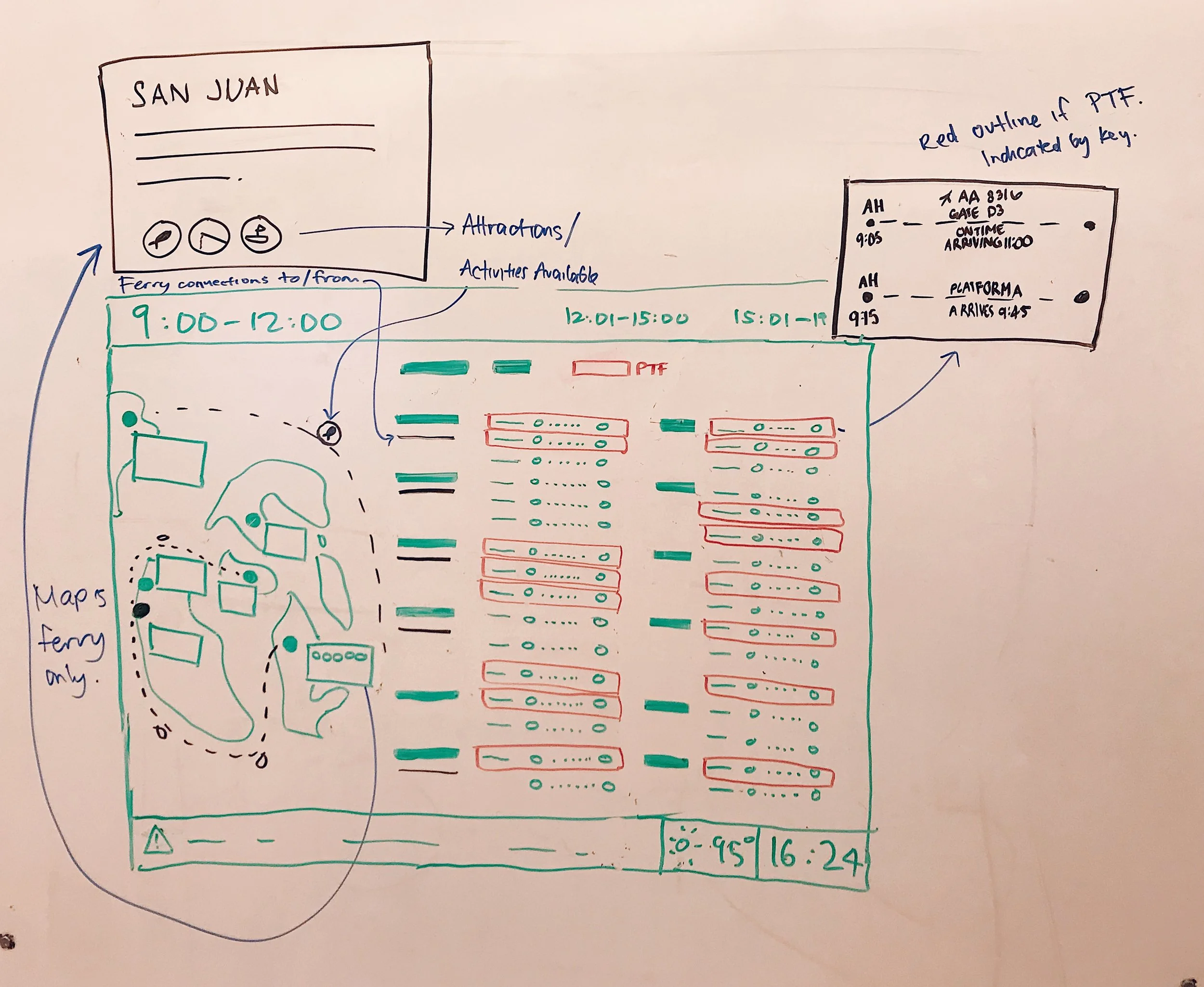
Our next iteration added another question to our process identified in iteration 1: Where do I want to go? The goal was for users to use the added map to determine where they want to go, and then use the schedule to determine how to get there.
Information we struggled to incorporate was the ferry schedule, since the ferries don’t leave from Atlantis Hub, they leave from one of three harbors. The solution came from the map, which would also include ferry routes between locations.
To emphasize the PTF pass, we highlighted the flights and trains that were eligible for the pass. This way, users had a visual way of viewing the benefits of purchasing the pass.
High-Fidelity Mockups


In our first iterations, we explored various different color schemes and font styles. We wanted to prioritize:
- Promotion of the PTF pass
- Interactivity between the map and schedule
- Information Hierarchy so users can easily find the information they need
Iteration Three — Revising the Layout

After our first critique, we realized two main problems:
- Our color scheme was too dark and unreflective of the San Juan Islands which offers a colorful and exciting experience. We had not incorporated the “fun” atmosphere we had aimed to implement
- The schedule appears too cluttered, which does not meet the stakeholder’s criteria of a readable and clear visual display. Furthermore, the design only allows for a few departures to each location at a time. This restricts the user’s flexibility and add more stress.
To combat these problems, we returned back to quick hand sketching to modify our original layout. Rather than switching between screens based on time, we are now switching between screens based on location.
Iteration Three -— Mockups
Our next iterations focused more on color and icons to create a more consistent theme. The bright visuals draw users of any age in, and invite them to engage with our display.
We decided to highlight only a few islands on each page to not only display more times for users, but also reduce cognitive load and help the user make a decision. The PTF is further highlighted by the blue shaded pills, and statuses are color-coded for clarity.
We also brought in several features to highlight the PTF Pass further with interactivity.
- Bolding the ferry routes of locations highlighted on the right
- Only displaying map features for locations highlighted on the right